Upcoming UX Design Trends: What to Expect in 2023
A year ago, some designers were openly talking about upcoming trends in 2022 — for example, fashion magazine decor, UI digitalism, overlapping elements, neon accents, and 90s-style design. And we can’t say that they were wrong, because for a whole year users have seen really similar designs on many platforms.
And those who took advantage of the tips were able to attract customers due to their modernity and adjustment to trends. So now, in the run-up to 2023, it’s also worth exploring some of the likely hit points, both for freelance designers working on various projects and professionals who want to achieve great digital marketing in a particular company. Let’s get started!
The fashion for anti-modes actually began quite a long time ago, when users got the opportunity to change the day mode to the night one, adapting the screen to the lighting and their own preferences. And over the years, certain research made in 2021 has shown that:
Thus, in 2023, maximum emphasis should be placed on the development of anti-light designs. Many people are tired of too harsh light, so the development of several dark modes with different colour schemes will definitely appeal to customers.
The cursor is literally an indispensable element that every user is used to. It, silent and functional, can also become interesting for the site visitor if the specialist takes care of an interesting design!
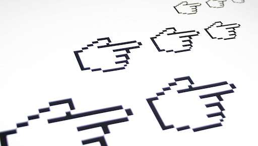
Recently, the number of extensions for Google Chrome has been growing strongly, allowing you to apply custom cursors. An example of the introduction of the original cursor can be Duolingo, Tiktok, and Discord. Actually, this feature helps to increase brand loyalty — so, create your own unique design to draw the attention of the client in 2023.
Now every user has at least two devices (smartphone + PC, smartphone + laptop, smartphone + tablet, and other combinations), so it is extremely important to make a design taking into account the interaction of these platforms. Customers should transition from micro (mobile) to macro (desktop) in a comfortable and seamless manner. And knowing how to easily map a user’s path from one device to another without wasting time familiarizing themselves with a new interface is an essential skill for a designer in 2023.
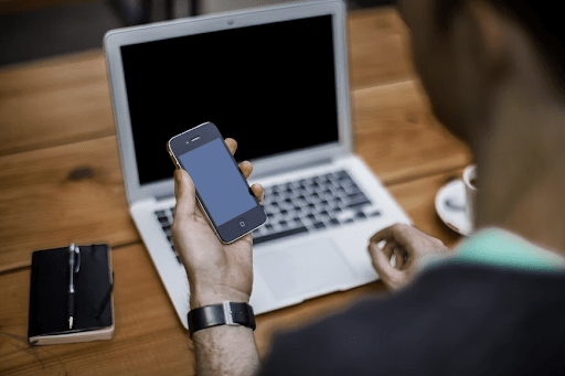
A good example of cross-platform collaboration would be copying text on an iPhone to pasting text in real-time on a Mac. A simple but very useful and necessary feature.
Design without micro-interactions seems flat and uninteresting, and that’s a fact. So the task of modern design is to make them as detailed and advanced as possible. On the one hand, this trend doesn’t seem too “useful” because the main purpose of micro-interactions is just to please the user, not to serve any specific function. On the other hand, showing something that will be friendly and memorable on the site can increase brand awareness.
For example, as soon as the user fills out an order form, it’s not enough for the site to simply accept it for processing — but it will be cool if the designer creates an interesting animation that will make it clear that the operation is successful.
Ombre was really popular maybe five years ago while gradients have practically not left the trends. Have you thought about how they differ? It’s time to figure it out, as both techniques will be required in 2023:
Now the “flat” design looks a little boring, but instead of minimalism, designers should apply some beautiful transitions & make images more voluminous. All this can be done with a gradient or ombre. Both techniques make images more attractive, the design gets more dynamic, and static elements become more energetic and beautiful.
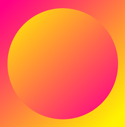
Specialists can mix colours in several ways. The most common are linear or radial gradients. Note that a linear one is only recommended for square or polygonal areas, and a radial one is best for round areas.
The second important tip: in order for a design with such an effect to look well thought out, designers need to choose the right shades using the colour circle. Monochromatic and complementary combinations look best.
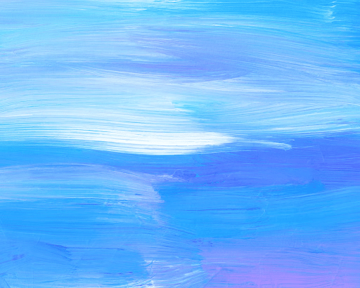
Also, to get inspiration for creating stylish ombre/gradients, you can not only search for ideas of colour combinations or shapes in your head but also look at popular web design products with a similar effect on marketplaces such as MasterBundles.
Neo-Brutalism comes from the classical roots of Brutalism, an architectural movement from the 50s to 70s that emphasized raw, exposed materials (e.g. concrete, rocks). The neo-version of the trend has been gaining momentum in web design since its digital renaissance in 2014. An unstyled HTML, plain backgrounds, asymmetrical layouts, standard computer fonts, and raw photos — all these are examples of neo-brutalism that can be super trendy in 2023.
Actually, this technique puts functionality above form. It will demonstrate the simplicity and ease of navigation, saving the user time to get used to the interface. In general, neo-brutalism is relevant for any type of design, but it is most appropriate for digital products due to its good compatibility with the limitations of the screens of various devices.
E-commerce businesses will probably never be the same once augmented reality and video demos have been incorporated into designs. This has become a great way to engage the customer and get them up close and personal with the product. And, most likely, technology will become one of the main trends of 2023 — and most attention should be paid to its offshoot, namely, immersive scrolling.
It’s time for designers to start learning how to showcase their products in a more meaningful way than just photos. Thanks to Javascript, animation libraries, and native implementations (such as linear interpolation methods), creating smooth animations and customizing component scrolling behaviour is easier than ever. With immersive scrolling, the content presentation will become more narrative-driven.
A huge number of modern users like the digital well-being trend — they most likely have a couple of different tracker applications on their smartphones to explore various parameters (Did you drink enough water? How many steps did you walk in a day? and so on).
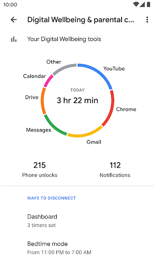
And at the moment, people are frequently worried that they are consuming too much content or spending hours scrolling through their news feeds. Take advantage of this and follow the trend of digital well-being. If you are creating a product that is aimed at entertainment and may attract the user too much, be sure to add a control tool — for example, a graph with the amount of time spent on the portal, timers reminding the user to give the eyes some rest from the screen, and so on.
In addition to working with SEO techniques, updating content, and making a user-friendly interface, there is another cool method to attract customers. At the moment, probably every adult and teenager knows about the trend for sustainability and the mass movements seeking to protect nature and reduce resource consumption.
So try to create a circular economy, adapt your digital product and give it an unlimited life in a closed loop. Start with discreet environmental notices or friendly animations, then incorporate environmentally and socially conscious design elements into your brand’s websites and apps.
Let`s discuss certain examples:
Nostalgic designs are loved by everyone, from Millennials who are fans of the 90s to generation Z who are in awe of retro! And it seems that this trend will remain popular in 2023. Most likely it will also be displayed on the user interface.
So, in the current year, experts can see designs with a lot of well-defined bold text with a palette of almost 70s. But in 2023, designs are predicted to become more edgy and edgy (like what we see in fashion on the SS23 runways in Copenhagen and New York — after all, fashion and digital designs overlap quite a lot).
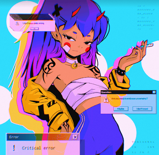
So, in the next year’s trends, we will definitely meet elements of the 2000 and the influence of neo-brutalism — perhaps another part of this chain is the rise in popularity of anime! Users are now often enjoying Japanese comic-style animations as well as games (like Genshin Impact), so this could probably develop into a full-fledged trend of catchy user interfaces.
Most stores have their own websites where all products are presented — but unfortunately, no photo can guarantee the client that the selected jeans will fit well or that the selected table will fit the interior of the room.
And now more and more brands are introducing AR / VR technologies into the design of their platforms which can solve this problem. It’s pretty rational, especially after Rebecca Minkoff brand`s research. While experimenting with 3D models, specialists learned that:
Another study was conducted by Gunners Kennels. After adding AR, cart conversion increased by 3%, order conversion by 40%, and interest rate decreased by 5%. So adding augmented or virtual reality to user interfaces is the #1 trending challenge for professionals!
In fact, the abundance of potential trends for 2023 will surprise even an experienced designer — in various lists, you can see not only the nuances that we have described but also other options. For example, simplified logos, adaptive zoom, “sweet” themes and candy colour schemes, obsession with deep sky colour or glassmorphism.
That is why designers should carefully study trends in order not to miss a single interesting solution that can soon become a hit and attract a huge number of customers. We hope our recommendations were helpful — good luck with creating masterpiece user interfaces!
As an SEO agency in Ireland that offers SEO in Cork & SEO in Dublin, we also provide affordable and creative web design services that take UX into consideration. We have a dedicated team that works on WordPress web design specifically. Our agency has helped an array of clients, in all sorts of industries. Check out some of our work. We have recently designed Complete Plumbing Solutions, Brosnan Property Solutions, Wizer Energy, Digital Funnel and plenty more websites.
Copywriting 2022 Digital Funnel Ltd.